deposits · BOG App
Helping people feel sure before they put money away
Redesigning BOG App's deposit opening experience from product-name selection into a guided savings framework.
deposits · BOG App
Redesigning BOG App's deposit opening experience from product-name selection into a guided savings framework.
the app, the stakes
BOG App is Bank of Georgia's retail banking superapp with close to 2 million active users. Deposits were one of its core savings products: around 490,000 active deposits, around 4 billion GEL in total portfolio value.
Digital deposit share was growing. The app was increasingly carrying the advisory work that branches used to do. When someone needed to understand which deposit to open, there was no longer a person across a desk to help them. That gap had to be designed for.
how the work started
The brief was a deposit opening redesign.
Before touching anything, I went back through what we actually knew — past research, behavioral data, support patterns. Some of it existed. A lot of it didn't. So before the redesign began in any real sense, I initiated the work that would make it possible: naming research, usability sessions, intent analysis.
You can't redesign a decision flow without understanding where the decision is actually failing.
what the data said
The existing flow offered two paths: choose a deposit directly, or use "Advise me a deposit" — a short questionnaire that recommended a type based on user answers.
The usage split was immediate:
Users preferred direct control. But the direct path wasn't supporting the decision — it was presenting product names and expecting users to make sense of them alone.
The advisor path had a different problem. It asked the right questions, but didn't fully resolve the decision. Users still had to evaluate the recommendation and decide whether to trust it.
And this: Term deposit was recommended 20% of the time. Opened only 7% of the time after recommendation. The advisor was suggesting one thing. Users were doing another.
the naming problem
Some users had deposit experience — they'd opened one before — and still couldn't correctly explain the type they had. Not because they weren't paying attention. Because the product names weren't describing what the products actually did.
Call Deposit. Fixed Deposit. Growing Deposit. These names made internal sense. They didn't translate into user understanding of behavior, flexibility, or trade-offs.
We didn't remove product names. We stopped expecting names to do all the work.
If a user could own a deposit and still not understand it by name, the redesign couldn't rely on names as the primary decision layer.
the old flow, diagnosed
The existing flow looked balanced — choose directly, or get advice. In practice, both paths had the same problem.
Rules appeared too late. Configuration happened before understanding. Users were asked to commit to a product they hadn't yet been introduced to.
The most important information — what does this product do, what are the trade-offs — came after commitment had already begun.
Original interface — Georgian language
the reframe
This wasn't a discoverability problem. Users were finding deposits. They were hesitating at the moment of choice because nothing in the flow was giving them enough to feel sure.
Moving understanding before configuration was the core of everything that followed.
first version — right direction, not the clean one
The first version shipped with the intention-based structure in place. The numbers moved. The direction was right.
But it launched with more complexity than I'd have chosen. Cross-sell products were present inside the flow in a way that added noise at exactly the moment users needed clarity. The information pages that would have made each product feel understandable before setup weren't there yet. Product teams had roadmap ambitions that were reasonable on their own terms, and I hadn't yet built a complete enough evidence base to move them.
That's not a failure. That's how product work actually goes. You ship what you can get to, you watch carefully, and you learn.
what the monitoring showed
After launch the team monitored closely. When the opportunity came, we pushed for a full story analysis.
Real progress. But the data also showed where users were still pausing — near target amount, account selection, and the supporting services, where users weren't sure whether Piggy and automatic transfer were part of the deposit or separate products inside the same flow.
The cross-sell friction I'd flagged earlier was now visible in the numbers. That changed the conversation. Arguments I'd made before now had evidence behind them. The business understood. The cleaner solution got built.
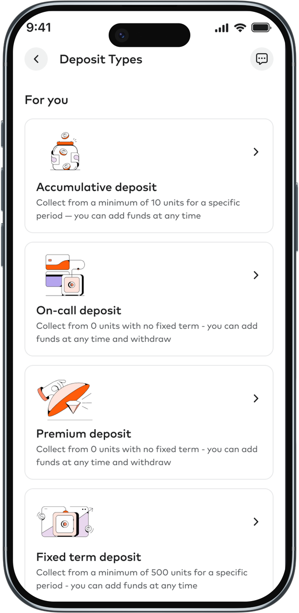
the shipped solution — three steps, one decision
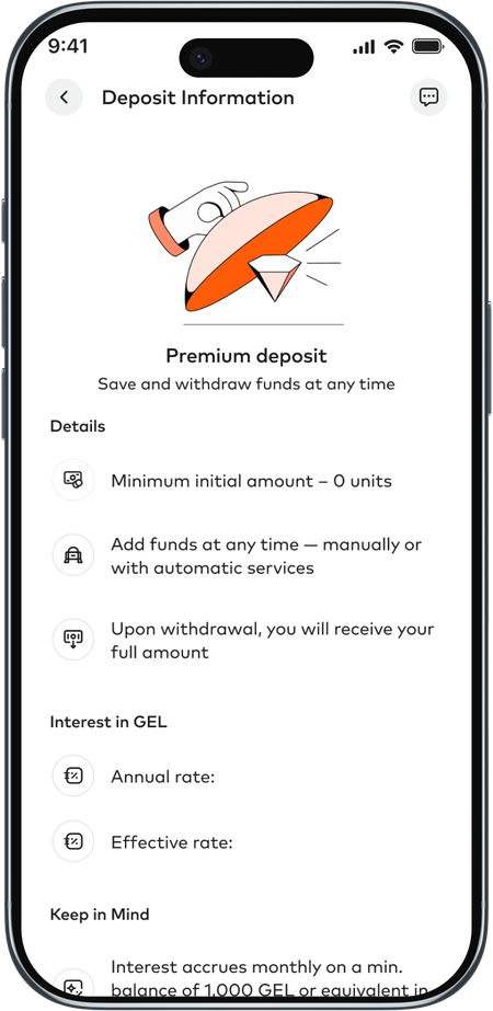
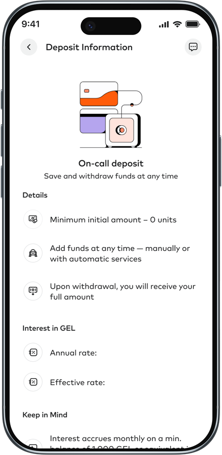
A dedicated information page before any configuration. What is this deposit for? Can I add money? How flexible is it? What happens if I break it early? Product names stayed — but backed by plain descriptions of behavior and trade-offs.
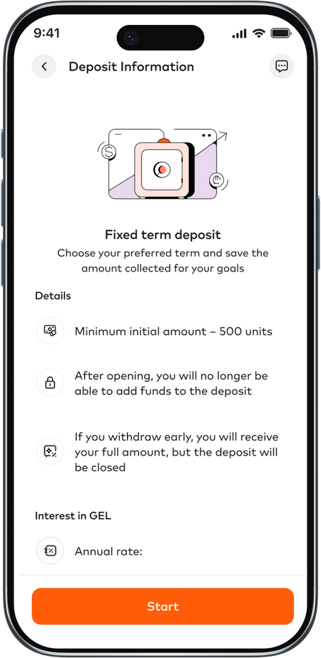
Once the product was understood, setup became a builder. Term, amount, account. Each step grounded in a decision already made. Cross-sell appeared here as a subtle, optional detour — not a gate. A quiet prompt users could take or skip.
A clear summary before commitment. Conditions, terms, what they were signing up for. Confidence before the tap. The setup screen was no longer the place where users had to discover what the product meant. It became the place where they shaped a decision they already understood.
the harder parts
Piggy and automatic transfer were useful. But explaining them inside a deposit flow required care — users needed to understand whether these were part of the deposit or separate, whether amounts shown were interest or their own contributions, and whether they could skip or change them later.
Testing showed the main decision got clearer. Financial complexity remained layered. Effective interest, advance payout, and the calculation logic behind supporting services still needed work after launch. The flow got cleaner. The financial education problem became more visible and more addressable.
scaling the framework
Had existed only through branches. Digitizing it meant reusing the information-first framework, adapted for a different emotional and legal reality — saving for a child, long-term commitment, parent and guardian logic, early withdrawal rules.
Had investment-like behavior. Users needed to understand how money behaves over time before committing. Same decision logic: understand the product, then configure it.
Different products. The same underlying problem.
impact
Conversion, completion rate, and time-to-open data still being tracked.
what this taught me
Simplifying banking complexity doesn't mean hiding the details. It means sequencing them.
Users weren't afraid of financial information. They were uncomfortable making a commitment before it made sense. The fix wasn't to reduce what the flow communicated — it was to change the order.
Moving an organization takes the same logic. Research that reframes a problem is more durable than a redesign that replaces a UI. When the data confirmed what the research had suggested, it wasn't a victory. It was a baseline. The real work was building enough shared understanding that the right solution became the obvious one.
The challenge wasn't to make deposits easier to find. It was to make them easier to choose.